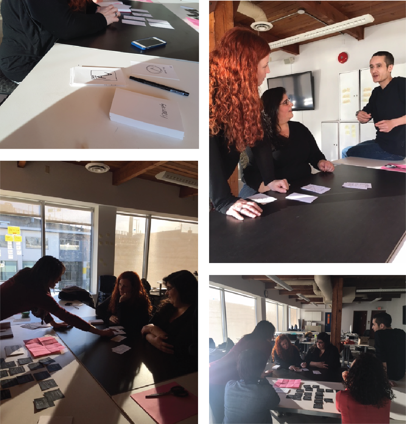
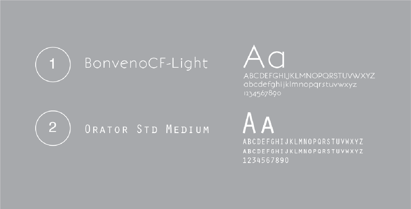
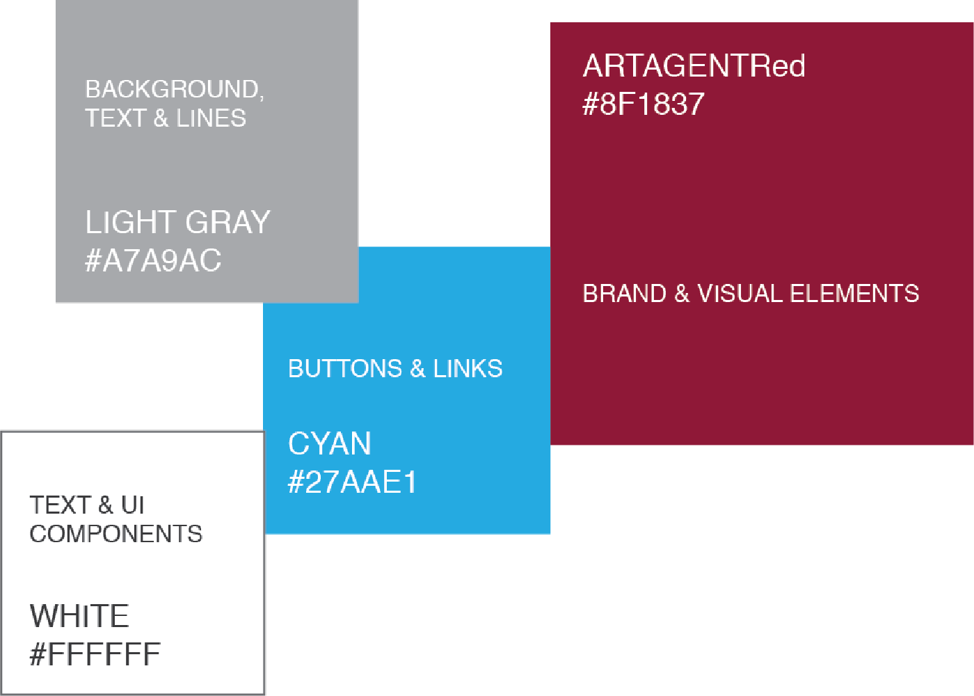
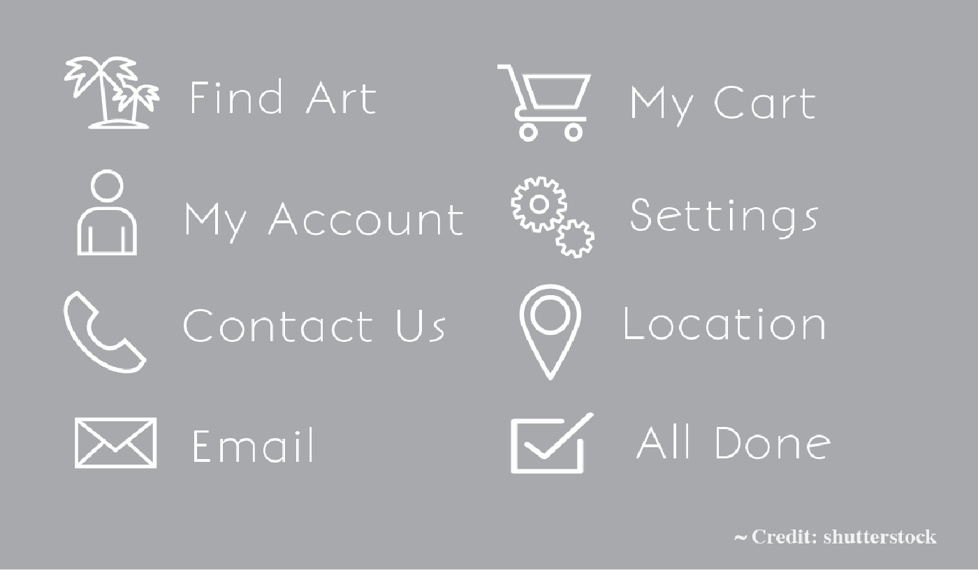
Website Generator

Case Study: Art Agent

Mobile App Design, Branding, UI, UX

The Task
Design an app concept based on a topic relating to our background. The topic I received was Emerging Artists
My Process
I started with brainstorming ideas by cardsorting then moved to my sketchbook, then I digitized and prepared the concept for low fidelity prototyping then moved to high fidelity mockups

The Result

A simple functioning app with an elegant fine art feel that allows users to find and rent artwork

Online Prototype

Brief

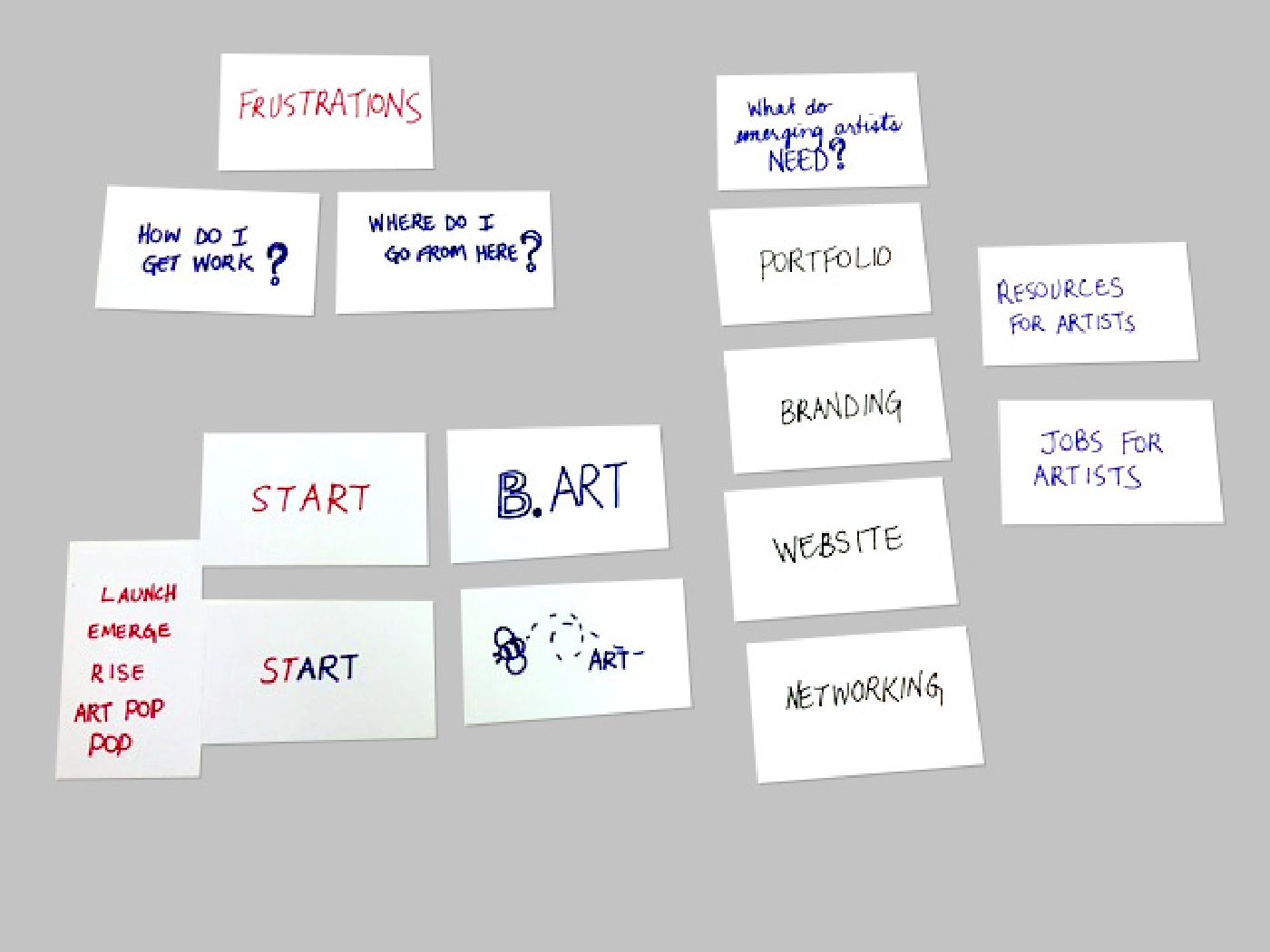
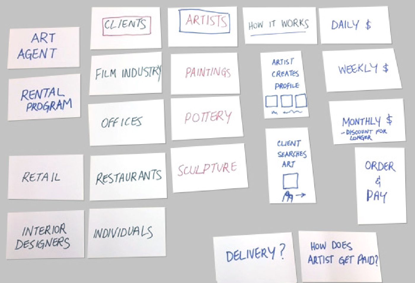
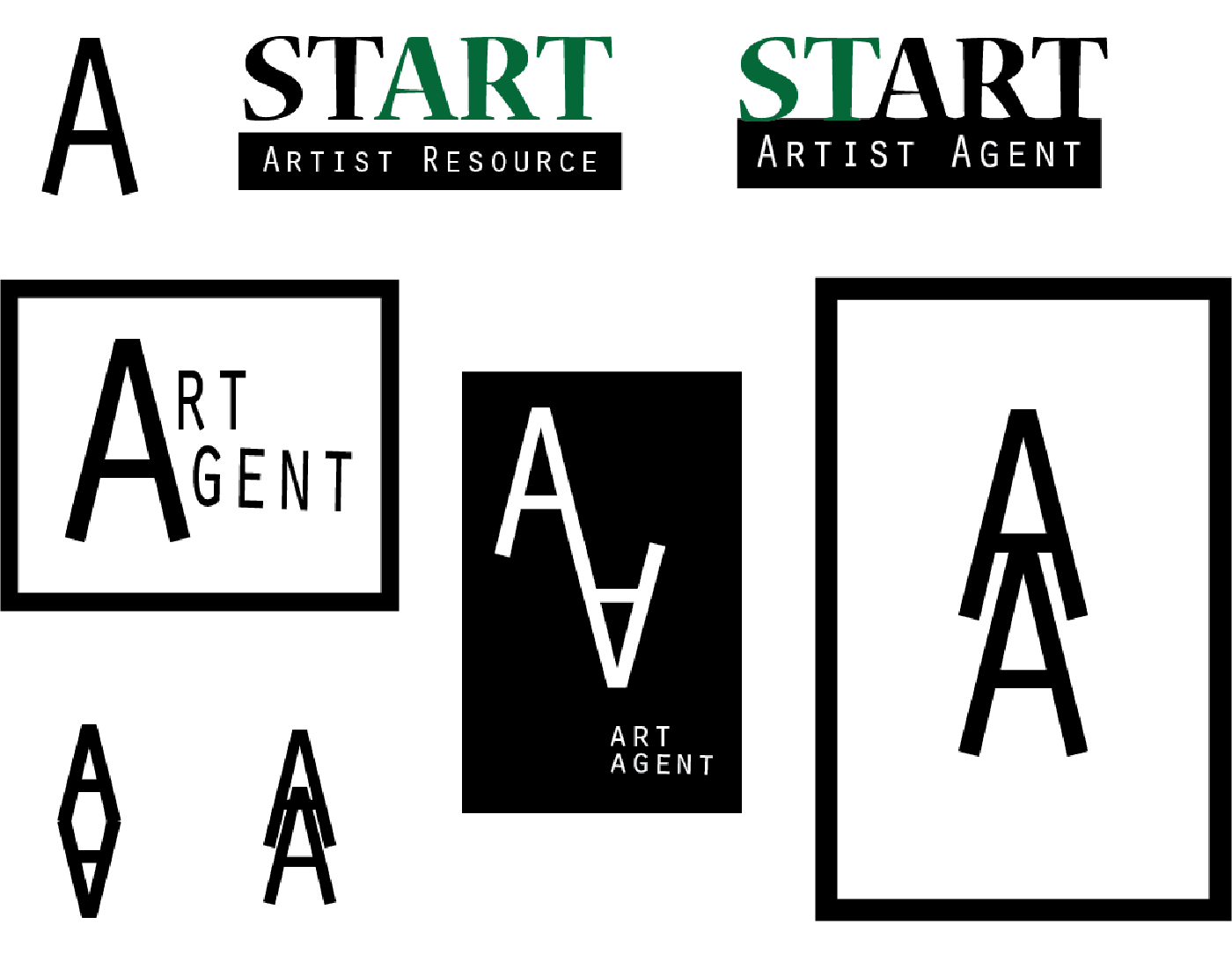
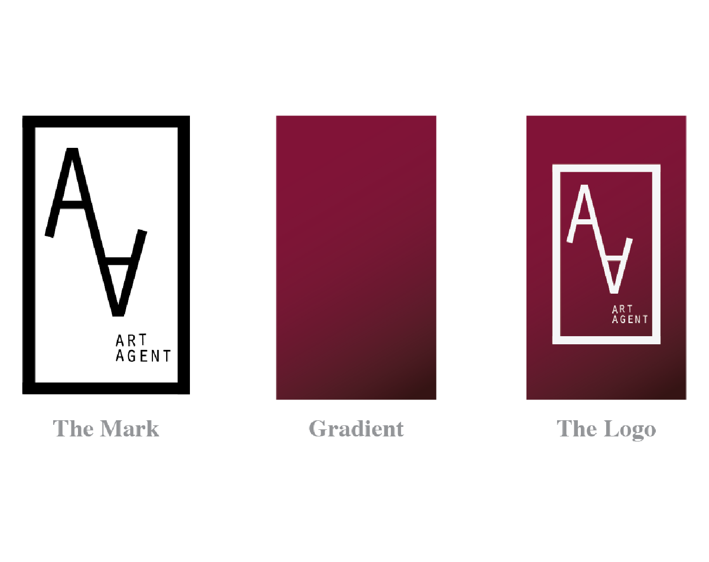
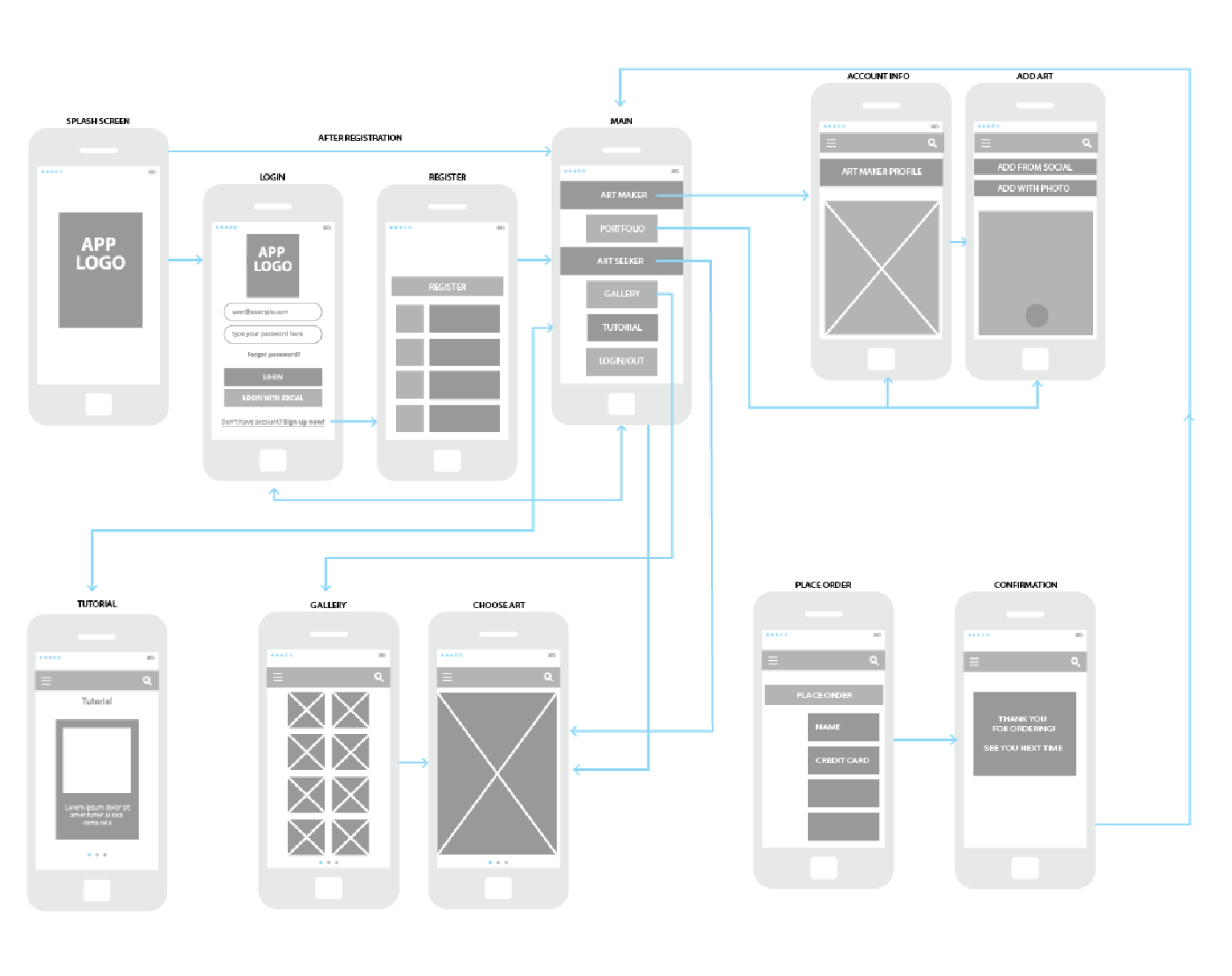
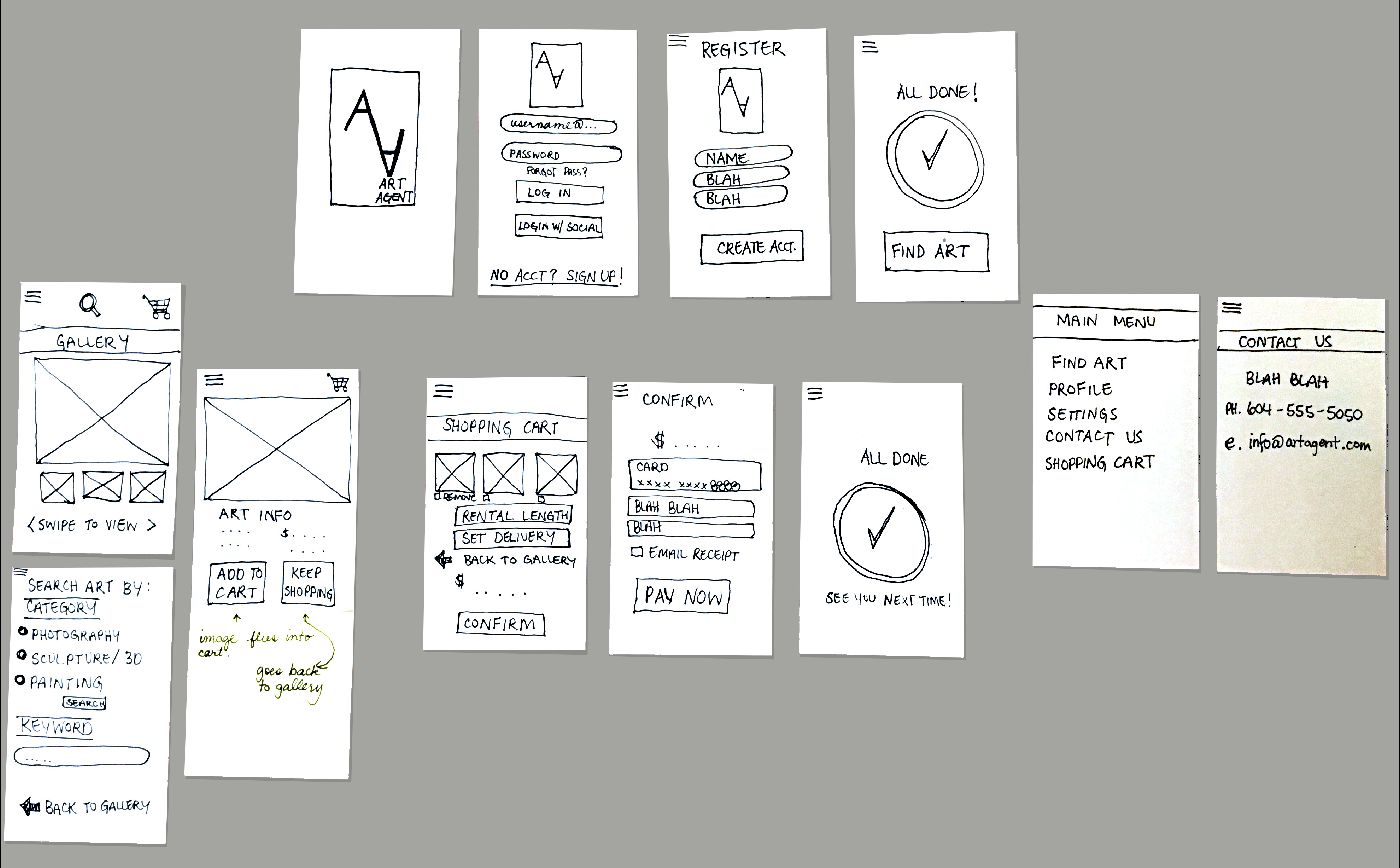
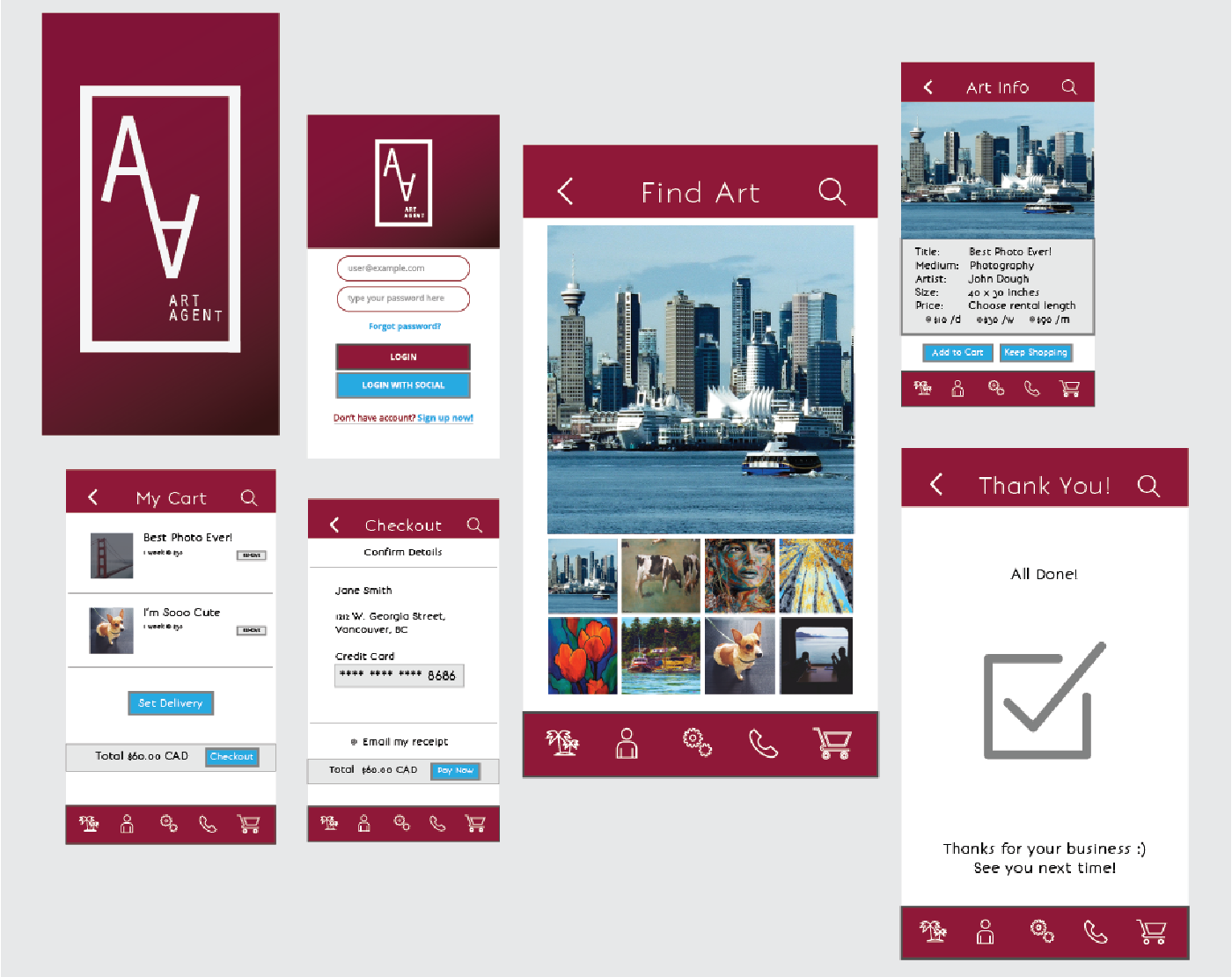
Tired of looking at the same picture day in and day out? Now you don’t have to, with the new mobile app ART AGENT ~ A full service art rental program that supports arts and culture in our beautiful city. Keep it fresh and change up images as often as you’d like. Featuring a large selection of juried works from Vancouver’s emerging and existing artists. We service the Vancouver Film Industry, Hotels, Restaurants, Retail, Local Businesses, Offices and Residential

Ideation

I started thinking about some of the issues that artists face and brainstorming possible names

Cardsort 2

Initially I came up with the art rental program that would have 2 user groups: Art Makers and Art Seekers. I later streamlined the app to focus on one user: the Art Seeker

Logo Sketches

Ideas for logo design. I started playing with the idea of pencils as a visual to portray the art aspect of the app

Branding & Logo Work

I wanted to create a mark that portrayed art, but yet was not too literal. I realized that the "A" itself looks like a pencil, so I simplified the design 

Final Logo

The rich dark maroon colour gives a feeling of Fine Art

Wireframe

I created a wireframe to show the flow and process for the user

Paper Prototype

 Paper prototyping allowed me to see how the app would work and find any bugs that needed fixing

User Testing

User testing revealed that the app would be more efficient with one user group. I then shifted gears and focused the app on Art Seekers only. The new concept would have all artists work and profiles on the app before release to clients

Typography

I chose two contrasting typfaces, with a nice juxtaposition of bold and light 

Colours

I chose a rich dark mix of red and maroon to convey a feeling of Fine Art

Icons

I chose a fine line icon set to match the font bonvenoCF-Light

Screen Mockups

Final screens
View the Online Prototype

Share this site :)